
Why Google changed its logo: the thinking behind the design

From 1998 to 2015, the Google logo has gone through various twists and turns. But this latest redesign by the tech giant is decidedly its most significant one.
The change naturally threw netizens into an expected flurry. Social media is now rife with opinions, likes and dislikes.
Did Google really need it though?
Google will turn 17 this month, and they've already thrown a lot of surprises our way. From announcing a new parent company Alphabet to the logo change, Google knows how to keep the market focussed on itself.
Commentators find that the new logo is friendlier and more dynamic. The colours have been retained. It's the font and animation that have had a makeover. The new writing is very clearly aligned to match that of its new holding company Alphabet.
The company on 1 September, not only created a new logo, but a new brand identity.
Not just fonts but a giant leap
Since 1999, Google has stuck to the serif wordmark font. Over time, the company made certain small changes to its logo like removing the shadows & tweaking letter spacing. Nothing else has changed about the iconic logo.
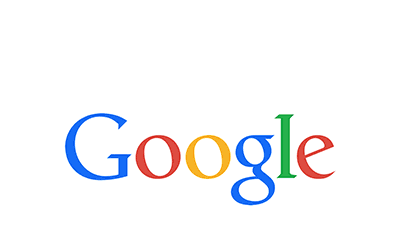
Google has now updated the logo with sans serif typeface, which incidentally is Google's creation. The world got the first peek of it when Google unveiled Alphabet's logo last month. Undoubtedly, the new logo looks trendier than the previous one.
Why have sans serif typefaces become popular suddenly?
Nothing happens without a reason and choosing the sans serif typeface for the logo also comes with good reason. The streamlined glyphs shrink done to very small sizes offers more legibility than other letters. The new logo reads well not just on a 2.5 inch Android Wear smartwatch, but also on a 50-inch television.
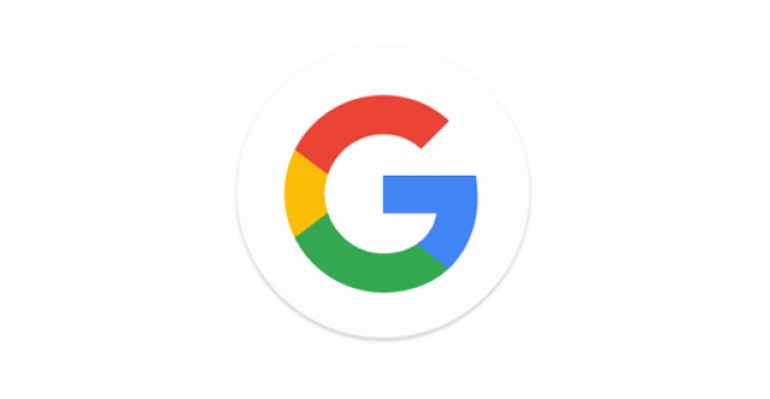
An even more significant change has happened to the favicon - the single-letter icon that appears in your browser tab when you load a website. Google's default lowercase 'g' favicon has been replaced by an uppercase one in the company's signature four colours.
Google's having some fun
The most drastic change that one would notice is that Google is not static anymore. Representing fun, Google has taken a giant leap and introduced an animated logo.
Like many other companies, Google too has shifted to an animated and dynamic logo which is only possible on a screen. The older one was, no doubt, more paper-like and a vegetable. As soon as you call Google to action, the letters in Google transform into a series of four dots that morph and orbit with life.
While doing a voice search, the Google logo will morph from 'Google' into the dots and undulate like water in anticipation of a query. As you start speaking, the dots will become like an equaliser, reacting to the sound of vocalisations. Just when you are done talking, the waveform will become dots again and spin as Google looks up for results. As soon as you have an answer from Google, the dots will return back to their normal self- Google.
Not just beautification but transition
Many may feel that the logo change is a quest for beautification by Google. Well, in plain words it is NOT. Users might, many a times, overlook the complicated workflow of Google. The change in logo is not just a superficial one. The animation in the voice search represents movement. It defines Google's belief that it is not merely a search engine, but a platform that offers a lot more. It is building a self-driving car, and beaming internet through balloons, and it is not just about relatively simple interactions like searching for the meaning of a word.
Google recently went through a rather big phase of transition and keeping up the trend, it unveiled a new logo which is modern, peppy and dynamic in every way.


![BJP's Kapil Mishra recreates Shankar Mahadevan’s ‘Breathless’ song to highlight Delhi pollution [WATCH]](https://images.catchnews.com/upload/2022/11/03/kapil-mishra_240884_300x172.png "BJP's Kapil Mishra recreates Shankar Mahadevan’s ‘Breathless’ song to highlight Delhi pollution [WATCH]")

![Anupam Kher shares pictures of his toned body on 67th birthday [MUST SEE]](https://images.catchnews.com/upload/2022/03/07/Anupam_kher_231145_300x172.jpg "Anupam Kher shares pictures of his toned body on 67th birthday [MUST SEE]")


